Did you know your brand’s judged for its creatives in a world driven by everyone’s opinion? The creatives you design for your social media ads, and well-thought banner advertisements that make people buy your products all add to your brand’s desirability quotient.
As an advertiser, you understand that making a brand stand out from the crowd can be challenging.
Your ads on popular social media platforms such as Facebook, Instagram, LinkedIn, Twitter, and Tiktok should appeal to your audience.
If they don’t, you can forget about your engagements and conversions.
We found out that the return of ad spent (the ratio of conversion value/cost) had interesting implications with well-designed creatives compared to low-end creatives.
At adcreative.ai, we discovered that highly well-designed ad creatives increased the ROAS by 14x!
The simple reason is that people click on something they find visually appealing. And if the messaging also resonates with them, they are more likely to check out your advertisements.
The problem with advertising is that there’s no way to understand if an ad will perform well or not.
Designing an ad is subjective and in the design team's purview. However, with technological advancements, especially machine learning and artificial intelligence, our team at Adcreative.ai decided to dwell deep into the concepts of visual ad designs and understand what makes them work.
So for all those advertisers who need a little motivation, inspiration, and insights, we have just the right piece of content for you.
For everyone who wants more out of their ads and wants to learn the trade tricks, we will also look at the top-performing creatives and break them down into simple components.
We will try and explain to you in layman's terms, and for those who want to take a deeper dive, we also break it down into the laws of visuals or UX working in their favor.
So in this blog, we will break down the different categories of banner advertisements a see what works and why?
5 Top Performing Banner Ads Breakdown
Check out the best-performing banner ads and why they are doing so well. We analyze these banner ads based on their attributes and some of the laws governing user experience.
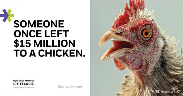
E*trade’s banner advertisement did exceedingly well. Not only is the ad humorous, but it also invokes a sense of shock and awe. If you look at this ad, it creates FOMO by giving you the specifics and establishes suspense by not naming the person who left the $15 million to a chicken.
While the prospect undergoes these myriads of emotions, which almost causes discomfort, the punch line(solution) that is subtly eased to create a sense of calm is not the focus of attention, and that’s why the reader’s vision would go there after checking out the image and text in bold first. That is, “Don’t get mad; get E*trade.”
So here’s a list of attributes that you can use while creating your viral banner ads-
Emotions
- Funny/Humor
- Shock (Bold Text/In your face with a strange fact)
- Suspense
- FOMO
- Discomfort
- Comfort with Solution
What principle/s is this ad based on?
Miller’s Law
The average person can only keep 7 (plus or minus 2) items in their working memory.
A picture of a rooster is undoubtedly eye-catching, with bold text, a logo, and a punchline. It has 3-4 simple elements that users would surely remember, making the ad great! So in this particular case, the idea is implemented straightforwardly.
Occam’s Razor
The best way to reduce complexity is to avoid it.
This ad is a perfect example of this principle. It avoids complexity by keeping it simple, with the components being a Rooster, bold text, followed by the tagline.
Analyze legibility and remove as many as possible without compromising the overall function. If you look at the background, there are no complex colors. The whole ad is split into two sections. One is with a neutral experience, and the other with contrasting colors to highlight the Rooster.
Consider completion only when no additional items can be removed. This also applies to the ad, as removing anything from this banner ad would make it incomplete.
How does Zelle use Creatives for Storytelling?
What is the first thing that you notice in this ad?
The two people?
Then Perhaps the colors and the objects, or the bold message?
A lot is going on here.
Emotions
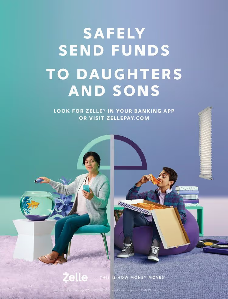
- This ad depicts two people in different environments, but our brain immediately forms a connection without even reading the text. We tend to notice the visuals first.
- We know that the relationship between the two is between mother and son. Moreover, from the creatives and the messaging, it is clear that the mother is sending her son money even without thoroughly reading the text.
- The ad shows the ease and comfort of sending money to your loved ones.
- We connect the two, even with the transition of the colors in the background.
- Notice how the colors are of similar shades in the color spectrum, signifying a deep connection between the two.
- It is easy on the eyes and helps one make connections even stronger and confirm our doubts if we have any. Furthermore, the messaging affirms this fact.
The way our brain works is to make such connections, as pattern recognition is one of the critical aspects of how it functions.
If we were to break down this ad according to user experience principles, we would find that it incorporates two laws.
- Aesthetic-Usability Effect
Users often take for granted that aesthetically pleasing designs are more usable.
Because an aesthetically pleasing design creates a positive response in people’s brains and makes them feel it works better.
- Law of Proximity
Objects that are near or proximate to each other are grouped together.
- Proximity helps to establish a relationship with nearby objects.
- Elements nearby are perceived to share similar functionality or traits.
- Proximity helps users understand and organize information faster and more efficiently.
If you notice the ad closely, we form a connection between the mother and son because they are grouped together nearby, albeit it is clear they are in different places.
This is a very clever use of this law, and that’s one of the reasons why it works so well.
- Law of Uniform Connectedness
Visually connected elements are perceived as more related than elements with no connection.
- It connects a group of elements of the exact nature via colors, lines, frames, or other shapes.
In this ad, notice the color transitions between the environments of the mother and son.
- Alternately, you can use a tangible connecting reference (lines and arrows) from one element to the next to create a visual connection.
If you notice the ad, there is a line dividing the mother and the son, yet you can form a relationship because of a tangible connecting reference.
- Use uniform connectedness to show context or to emphasize the relationship between similar items.
The North Face Ad
This is one of those powerful ads that everyone can relate to, especially someone who has a desk job(And most people do!)
It has the same vibe as that of Macintosh’s commercial of 1984, which inspired a whole generation to break free and adopt Mac instead of what big corporates at that time were selling.

Source- The North Face Ad Campaign
Now let's look at this advertisement.
It has many layers to it, and for valid reasons.
- The messaging here: “Sit for your job, Run for your life.” It's apt that most of us would relate to. It motivates people to go for a run to counteract the adverse effects of sitting all day for desk jobs.
- The runner Nikki Kimball, an American distance runner specializing in the Ultramarathon, is seen running wearing the North Face Jacket that is also shown at the bottom. Choosing a well-known role model motivates people to buy from the brand and use the product daily to solve a severe problems.
- Can you see how the terrain is layered on top of the message? “Run for your life.”
This also symbolizes that you need to take the rocky road to save your life. It is inspiring in many ways, and the brand messaging is spot on for regular people.
The laws of UX working for this Ad- The Goal Gradient Effect-
The tendency to approach a goal increases with proximity to the plan.
Notice how the gradients are used in this ad to show what goals you can achieve, interchanging the background and the text overlays to highlight the point that you need the brand’s product to counter the adverse effects of sitting on your desk every day!
This is a pretty clever use of this principle.
The simplicity of Docusign
Source- Docusign Ad Campaign
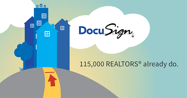
One may think there is not much attention to design, or it has been put together in haste. But that is far from true. There is a reason for doing this-
- It focuses all the attention on the target audience by putting in the exact number.
- The contrasting colors and simple illustrations make it easier to remember the ad.
- There is a subtle reference to a new way of signing documents on the fly. This is achieved by depicting a cloud with the brand's logo.
- Notice how the yellow and red have been used to grab attention to show that your path to success as a realtor is with Docusign! (We bet you missed this reference!)
- It also has its target audience mentioned with facts about the number of users in the real estate market, and this is the core message they want to highlight.
Every advertiser should note how this advertisement works because it proves that.
- You don’t have to overthink
- Or try complicated design processes to achieve the desired results.
Laws working for the Advertisement
The law of simplicity states the more complex your design, product, or service, the less your users will want to use it, and the harder it is to communicate its value to them.
So as you can see that the simple illustrations, numbers, and messaging are for the audience to understand what the product (DocuSign) does for the target audience(Realtors)
Happy Money- How they made their advertisements relatable?
This ad uses yellow, the most attention-grabbing color, to ensure their audience can’t ignore it. Then they are treated by a pleasant image of father and son(our brain instantly correlates) having a good time on the beach with the waves splashing around, and the message here is exact. So it comes across as an honest ad. Especially in the financial domain, where the target audience is more skeptical, the ad needs to build trust.
The message is in black and white and mentions what rate they offer. Happy Money’s motto is simple and easy to remember- Less Debts, More Adventures, and the visuals live up to the hype!
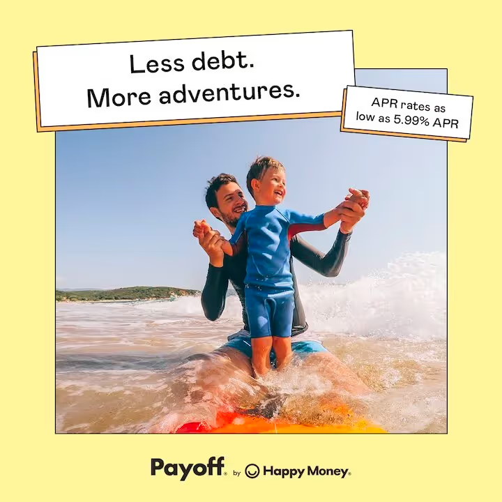
Source- Happy Money Ad Campaign
The Feelings it Invokes-
- Trust
- Happiness
- Clarity
- Purpose
- Honesty
This ad is appealing and successful because it takes into consideration four basic laws of successful advertising that are-
- Choosing the best colors possible
- Showing Humans in your Ads
- Conveying positive vibes for people to relate to your brand
- Giving context to your product or service and your offerings
Ads that focus on “Discounts.”
You may have seen numerous ads offering discounts for a limited time. We see so many ads following the same practice that it has become a routine for brands.
When brands approach discount ads with thoughtful strategy and intention,
- It can increase customer acquisition,
- Foster long-term customer loyalty, and
- Improve customer lifetime value.
Psychological reasoning behind how discounts work
According to research, this works based on two primary principles.
The pleasure Principle explains our need to seek pleasure and avoid pain.
Most companies/brands offer a limited period discount, and because of the limited number of days of the bargain and the (seemingly) unmissable offer, people tend to avail of it.
Getting something one wants on a deal is pleasurable, but missing out on the proposal often involves a sense of pain and discomfort.
Regulatory Focus Theory. According to researcher E. Tory Higgins, there is a direct relationship between a person's motivation and how they achieve their goal.
According to regulatory focus theory, human motivation is rooted in needs for advancement (related to approach) and security (related to avoidance). This principle is seen in action when you know some discount ads offering deals such as “Get $,” while some say “Save $”. They both mean the same thing, however, both are focused at different set of people one who’s motivation is rooted in needs for advancement and the other related to avoidance.
So offering deals to people who want a specific product or service often leads them to at least consider it and weigh the pros and cons of getting it.
The motivation of each individual may be different based on various factors. These factors can range from
- Immediate Need
- Value Proposition
- Affordability
- The Desirability of the Product/Service
- Purpose
- Usage
- Availability/Scarcity
Based on all this information, we think you would be able to analyze these advertisements much better!
Let us know about your analysis. We would love to hear from you- at contact@adcreative.ai.
Here are some of the best discount ads
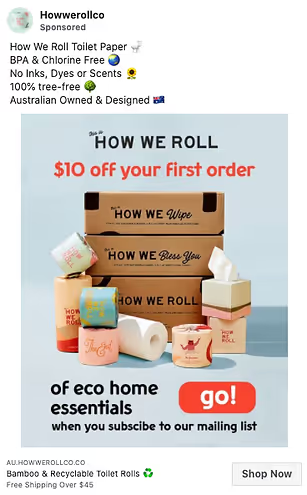
A toilet paper company named “How We Roll” would catch people’s attention. But the best part is that they have all the good stuff, no harmful chemicals or dyes, and it’s recyclable.
So if they’re offering $10 off your first order, you take it!
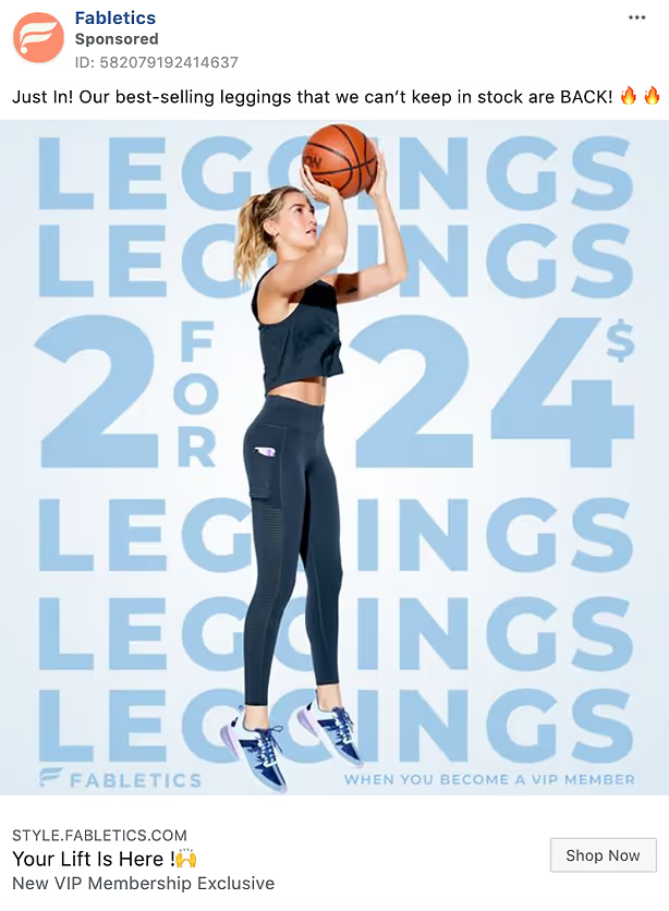
There’s nothing more compelling than your favorite sportswear in action. What’s more, it’s available for a great deal 2 for $24 when you become a VIP member! Overall a win-win for everyone!
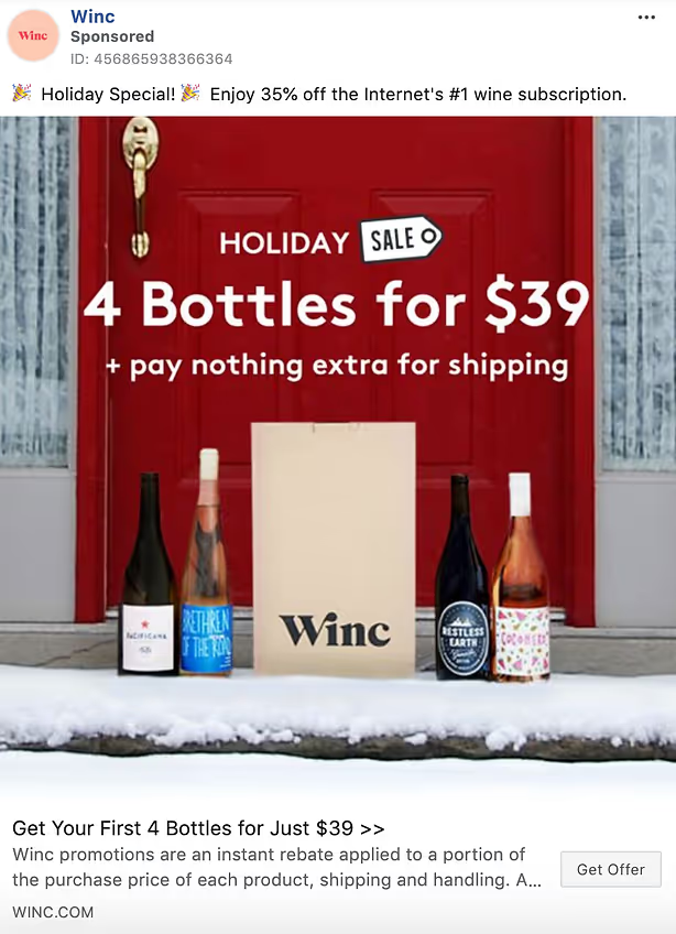
35% off on wine during the holiday season! That calls for a celebration already! Notice how they have used a Red Door to symbolize the holiday season along with the bottle of wine on the snow-covered porch. Making an ad memorable and eliciting an emotion of joy and celebration is often associated with drinking wine with family and friends.
So this ad hits the right chords, which is one reason why it is thriving!

A cat photo can win over the internet! Chewy has a cat as the focus of attention and the owner on the sidelines! As a pet owner, the brand lets you believe it is synonymous with unleashing your love for your pet!
The message is loud and clear. A discount code for 30% off and Free shipping!
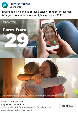
They have used an ad with Facetime to reaffirm that it’s even more affordable to meet in person than to see your beloved over the phone! Imagine spending just $29 to be with your loved one! This advertisement plays on emotions and is a deal too good to be true.
Especially post-pandemic, when people have been confined to their own spaces and not had a chance to meet their friends and family, this ad is pure motivation! Frontier airlines pull this one off perfectly!
Conclusion
Every great advertisement sparks something that makes a connection with us. How an ad touches and speaks to us dictates how we fall for the brand. This intimate connection is often established by utilizing deep-rooted human psychology and the different tested principles we discussed in detail in our article.
Read the concepts over again and make notes of the principles used in these exceptional advertisements.
Furthermore, try and use these concepts when you create your advertisements for a more significant impact on your target audience.


